

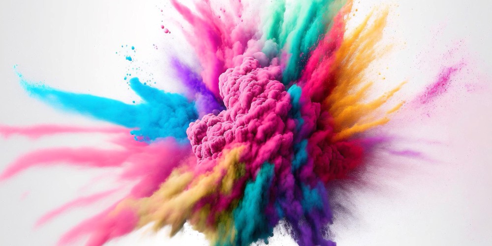
Colors in Printing: Colors play a pivotal role in the printing world, acting as the silent narrators of your visual story.
They have the power to stir emotions, deliver messages, and infuse vitality into your designs.
Grasping the essential rules of colors in printing is pivotal for those aiming to produce vibrant, eye-catching results.
Whether you’re navigating the realms of design as a seasoned professional or a fervent print enthusiast, these insights will empower you to excel in the nuanced art of color usage in your printing projects.

The journey into color mastery begins with differentiating RGB (Red, Green, Blue) and CMYK (Cyan, Magenta, Yellow, Key/Black) color modes:
Transitioning your designs from screen to print demands a deep understanding of these color modes. The shift from RGB’s luminous color spectrum to CMYK’s ink-based color production can significantly impact your design’s appearance.
Opting for CMYK from the start ensures your colors translate accurately from digital to print, maintaining the integrity and vibrancy of your designs.
Color calibration emerges as a critical step in safeguarding color consistency throughout your design and printing workflow.
This process entails fine-tuning your monitor and printer settings to achieve a uniform color representation:
To navigate the complexities of color calibration, investing in professional calibration tools is advisable.
These devices adjust your equipment to a standard color reference, bridging the gap between digital designs and their printed counterparts, ensuring your colors remain true from screen to paper.
Color profiles play a pivotal role in color management, dictating how colors are rendered across different devices and printing systems:
A close collaboration with your printing service provider can demystify the complexities of color profiles.
Sharing your design’s color profile with your printer ensures that the final product mirrors your original vision, with colors rendered as intended across diverse printing platforms.
Your project’s nature dictates the choice between spot and process colors, each suited to different design requirements:
Understanding these color models enables designers to optimize their creations for print, ensuring each element—from logos to detailed backgrounds—is represented with clarity and vibrancy. Matching the color model to your project’s needs can enhance the overall quality and impact of your printed materials.

The concept of color gamut is crucial in understanding the limitations and possibilities of printed colors.
This term refers to the range of colors a particular device or process can reproduce, highlighting the variance between on-screen colors and their printed counterparts:
An in-depth understanding of your chosen printing method’s color gamut allows you to navigate its limitations strategically.
By tailoring your color choices to align with what’s realistically achievable in print, you can maximize the visual impact and fidelity of your printed materials, ensuring they capture and convey your intended messages and emotions effectively.
By embracing these guidelines and considering the intricate relationship between color choices and printing capabilities, designers can unlock the full potential of colors in printing.
These strategies not only enhance the visual appeal of printed materials but also ensure that they accurately reflect the designer’s vision, achieving a harmonious balance between creativity and technical precision.